Tabs
Content containers organized in multiple panels, allowing users to view one panel at a time.
| Recommended | Not Recommended |
|---|---|
| Group Related Content: Use for closely related information or functionalities. | No Essential Info: Don't hide crucial content that users might miss. |
| Progressive Disclosure: Ideal for breaking down complex info into manageable sections. | No Mixed Content: Keep each tab's content coherent and related. |
| Quick Filters: Useful for frequently switched content, like "Inbox" and "Sent" in an email client. | Avoid Complex UI Inside: Don't nest other complex UI components like carousels or additional sets of tabs within a tab, as it complicates navigation. |
{% include '@bolt-components-tabs/tabs.twig' with {
  panels: [
    {
      label: 'Tab label 1',
      content: 'Tab panel 1.',
    },
    {
      label: 'Tab label 2',
      content: 'Tab panel 2.',
    },
    {
      label: 'Tab label 3',
      content: 'Tab panel 3.',
    }
  ]
} only %}| Prop Name | Description | Type | Default Value | Option(s) |
|---|---|---|---|---|
|
attributes
|
A Drupal-style attributes object with extra attributes to append to this component. |
object
| — |
|
|
panels
|
All of the tab panels. Each panel should contain a label and content. |
array
| — |
|
|
vertical_tabs
|
Makes tabs arranged vertically - one on top of the other and place them on the left or right side of the content. |
string
|
none
|
|
|
align
|
Tab labels alignment. Horizontally arranged tabs can be on the left, center or right. When tabs are vertical, they can be at the top, center, or bottom if the height of the content allows. |
string
|
start
|
|
|
label_spacing
|
Set label spacing. |
string
|
small
|
|
|
panel_spacing
|
Set panel spacing. |
string
|
small
|
|
|
inset
|
Controls spacing placement on tab labels and panels. |
string
|
auto
|
|
|
selected_tab
|
- Minimum is
1 Set selected tab by number. To select the second tab, set to 2. |
integer
|
1
|
|
items
| Prop Name | Description | Type | Default Value | Option(s) |
|---|---|---|---|---|
|
label
|
Tab label used in the navigation. Twig only. |
string
|
Tab
|
|
|
content
|
Tab panel content. |
string
, object
, array
|
— |
|
|
selected
|
Set active state on tab. Only one active tab allowed at a time. Defaults to first tab. |
boolean
|
false
|
|
|
id
|
Unique identifier for each tab label, may be used for deep linking. |
string
| — |
|
npm install @bolt/components-tabsvertical_tabs prop, when tabs desired placement should be to the left or right. Please note that below 600px vertical tabs become horizontal.
inset prop controls how label_spacing and panel_spacing are applied. When set to auto (default), there is inset spacing around labels and no inset spacing around panels, which means panels are flush with the edges of the parent container. When set to on, spacing is applied around the labels as well as the panels. This works well in a container which has no inner padding of its own. When set to off, all inset spacing is turned off. label_spacing applies between labels rather than around them, and panel_spacing only applies above the panel, making the panel flush with the edges of the parent container.
auto, horizontal tabs.on, horizontal tabs.off, horizontal tabs.auto, vertical tabs.on, vertical tabs.off, vertical tabs.label_spacing and panel_spacing props, in conjunction with inset, to set spacing around tab labels and panels. See Inset variations page for more on the inset prop.
label_spacing to set spacing around (or between) tab labels.
smallautoonoffmediumautoonoffpanel_spacing to set spacing around tab panels.
noneautoonoffsmallautoonoffmediumautoonofflabel_spacing to set spacing around (or between) tab labels.
smallautoonoffmediumautoonoffpanel_spacing to set spacing around tab panels.
noneautoonoffsmallautoonoffmediumautoonoffcenter or end make sens only when your tabs total height is larger than content height or content height is larger than total tabs height.align: 'start' when vertical tabs are used, or be sure that all of your tab content is the same height.| Column 1 | Column 2 | Column 3 | |
|---|---|---|---|
| Row 1 | R1C1 | R1C2 | R1C3 |
| Row 2 | R2C1 | R2C2 | R2C3 |
| Row 3 | R3C1 | R3C2 | R3C3 |
| Footer | FC1 | FC2 | FC3 |
| Column 1 | Column 2 | Column 3 | |
|---|---|---|---|
| Row 1 | R1C1 | R1C2 | R1C3 |
| Row 2 | R2C1 | R2C2 | R2C3 |
| Row 3 | R3C1 | R3C2 | R3C3 |
| Footer | FC1 | FC2 | FC3 |
| Column 1 | Column 2 | Column 3 | |
|---|---|---|---|
| Row 1 | R1C1 | R1C2 | R1C3 |
| Row 2 | R2C1 | R2C2 | R2C3 |
| Row 3 | R3C1 | R3C2 | R3C3 |
| Footer | FC1 | FC2 | FC3 |
| Column 1 | Column 2 | Column 3 | |
|---|---|---|---|
| Row 1 | R1C1 | R1C2 | R1C3 |
| Row 2 | R2C1 | R2C2 | R2C3 |
| Row 3 | R3C1 | R3C2 | R3C3 |
| Footer | FC1 | FC2 | FC3 |
selected_tab prop to pre-selected a tab by number. To select the second tab, set selected_tab to 2. Defaults to first.
inset: 'off',
label_spacing: 'medium',
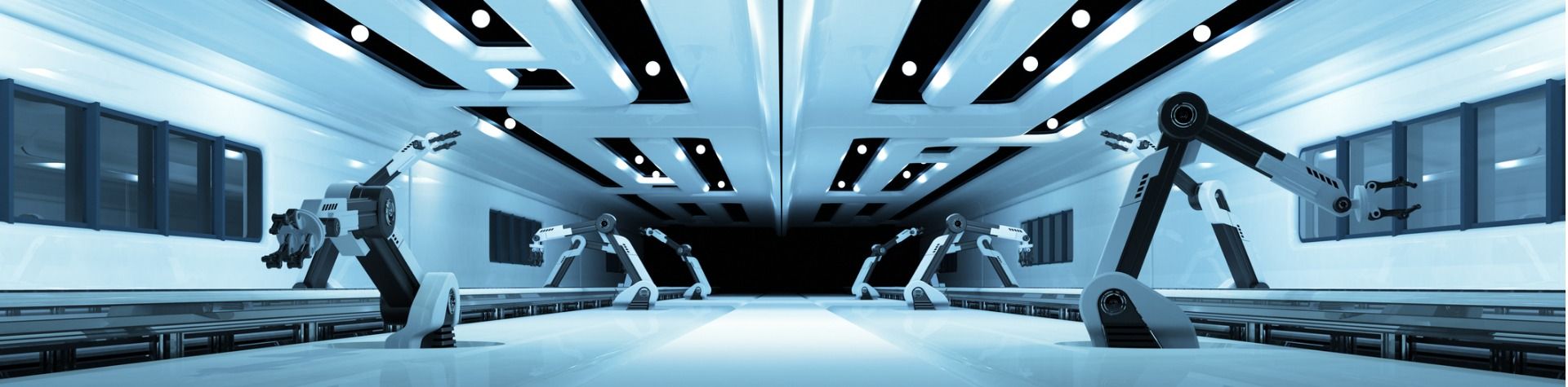
panel_spacing: 'medium',This is a Tabbed Band
Maximize Value with Next Best Action Intelligence
Blow away your customer’s expectations - engage each individual one-to-one, letting the AI constantly adapt to their needs.
Blow away your customer’s expectations - engage each individual one-to-one, letting the AI constantly adapt to their needs.
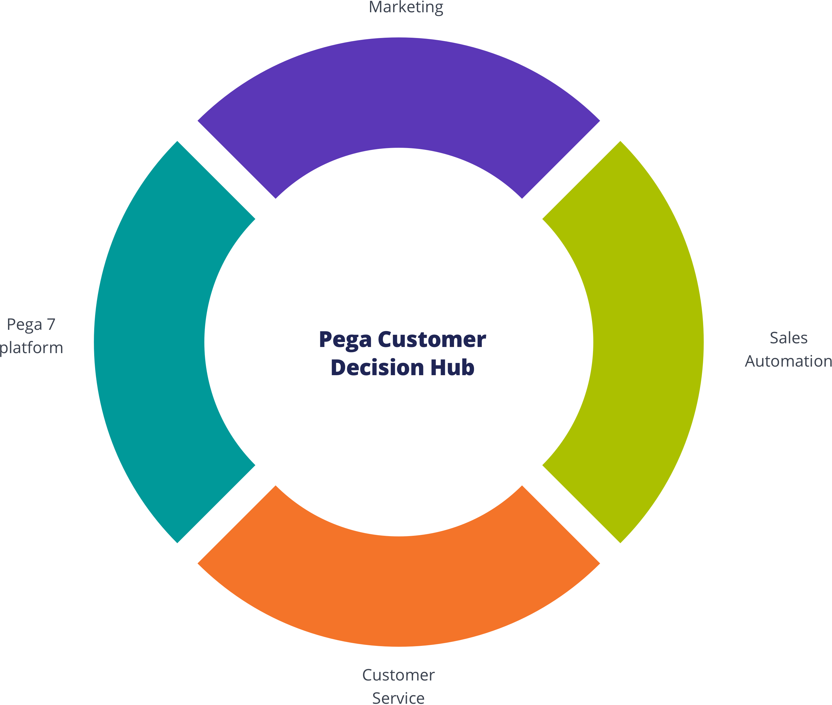
Customer Decision Hub
Infuse real-time AI into every customer engagement
There’s nothing artificial about Pega’s proven AI. This always-on brain gets results. Using pragmatic artificial intelligence and decision management, you can improve response rates by up to 6X, NPS by 30 points, and get ROI as high as 500%.
Call to Action<bolt-tabs> element containing multiple <bolt-tabs-panel> elements to create a set of tabs. Inside each <bolt-tab-panel> mark the "label" content with the attribute slot="label". Everything else is considered tab "content".
<bolt-tabs>
  <bolt-tab-panel>
    <bolt-text slot="label">Tab label 1</bolt-text>
    <bolt-text>Tab panel 1</bolt-text>
  </bolt-tab-panel>
  <bolt-tab-panel>
    <bolt-text slot="label">Tab label 2</bolt-text>
    <bolt-text>Tab panel 2</bolt-text>
  </bolt-tab-panel>
  <bolt-tab-panel>
    <bolt-text slot="label">Tab label 3</bolt-text>
    <bolt-text>Tab panel 3</bolt-text>
  </bolt-tab-panel>
</bolt-tabs><bolt-tabs panel-spacing="small" align="center">
<bolt-tab-panel>
<bolt-text slot="label">Tab label 1</bolt-text>
<bolt-text>Tab panel 1</bolt-text>
</bolt-tab-panel>
<bolt-tab-panel>
<bolt-text slot="label">Tab label 2</bolt-text>
<bolt-text>Tab panel 2</bolt-text>
</bolt-tab-panel>
<bolt-tab-panel>
<bolt-text slot="label">Tab label 3</bolt-text>
<bolt-text>Tab panel 3</bolt-text>
</bolt-tab-panel>
</bolt-tabs><bolt-tab-panel> by setting selected-tab on <bolt-tabs> or by adding selected to a single <bolt-tab-panel>.
<!-- Use `selected-tab` to set selected tab -->
<bolt-tabs selected-tab="2">
  <bolt-tab-panel>
    <bolt-text slot="label">Tab label 1</bolt-text>
    <bolt-text>Tab panel 1</bolt-text>
  </bolt-tab-panel>
  <bolt-tab-panel>
    <bolt-text slot="label">Tab label 2</bolt-text>
    <bolt-text>Tab panel 2</bolt-text>
  </bolt-tab-panel>
  <bolt-tab-panel>
    <bolt-text slot="label">Tab label 3</bolt-text>
    <bolt-text>Tab panel 3</bolt-text>
  </bolt-tab-panel>
</bolt-tabs>

<!-- Use `selected` to set selected taband vertical-tabs to display tabs vertically -->
<bolt-tabs  vertical-tabs="left">
  <bolt-tab-panel>
    <bolt-text slot="label">Tab label 1</bolt-text>
    <bolt-text>Tab panel 1</bolt-text>
  </bolt-tab-panel>
  <bolt-tab-panel selected>
    <bolt-text slot="label">Tab label 2</bolt-text>
    <bolt-text>Tab panel 2</bolt-text>
  </bolt-tab-panel>
  <bolt-tab-panel>
    <bolt-text slot="label">Tab label 3</bolt-text>
    <bolt-text>Tab panel 3</bolt-text>
  </bolt-tab-panel>
</bolt-tabs>