
Infinity 24.1
Do more with Infinity 24.1
Unleash impossible outcomes.
That's the power of enterprise AI.
Request a demo
Speed.
Ease.
Impact.
What if you didn’t have to worry about manual work: onboarding, data integrations, persona mapping, and all the other things that tie up your employees and slow down your operations? So much more is possible with the latest capabilities of Pega GenAI™.
Faster results. More efficiency. Made easy.
With the power of enterprise-grade AI, Infinity 24.1 can do more across the board – for your customers, agents, sellers, and developers. The possibilities are, well, infinite.

Instant insights, personalized
Get to market with better data, faster. Pega Customer Decision Hub filters customer insights in real time for true personalization right now. (And now. And now.)
- Contextualize your customer journeys by integrating streaming with newly added connectors.
- Use Key Audiences to showcase ROI across segments and track and report performance metrics.
- Curate marketing knowledge and best practices by tapping into Pega’s Generative AI Assistant. Info, instantly.

Customer context. Real time. Really helpful.
Accelerate access to your customer data without building custom integrations. Pega Customer Decision Hub makes it happen.
- Subscribe to syndicated feeds with newly added connectors. Ingest data in milliseconds.
- Aggregate customer profiles and unlock streaming insights with identity management.
- Use the Pega Generative AI Assistant to curate decisioning best practices and knowledge management. In other words? It’s a snap.

Make every seller your best seller
Accelerate deal cycles from end to end by increasing productivity with Pega Sales Automation.
- Sales cycles at warp speed. Use Pega GenAI Coach™ and Pega GenAI Knowledge Buddy™ for real-time guidance and insights.
- Meetings all prepped. Pega GenAI Analyze™ creates on-demand briefings that provide talking points, stat.
- Communications, streamlined. Get real-time response and email-craft suggestions with Pega GenAI Automate™ and Digital Messaging.

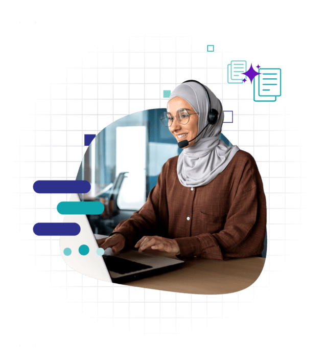
Customer Service
Customers self-solve. Agents outperform.
Pega Customer Service enables customers to get the resolutions they need, with seamless, connected experiences. And for agents? Gen AI helps resolve cases quickly and securely.
- Use Pega’s contextual self-service to empower customers.
- Agents and customers can get guidance and insights instantly with Pega GenAI Knowledge Buddy™.
- Every interaction, now at the speed of gen AI. Pega GenAI Automate™ and Pega GenAI Analyze™ reduce wrap-up time with summaries made for you and set next steps for agent-assisted service.
- Pega Voice AI makes contact center staffing easier with real-time, multilingual translation.
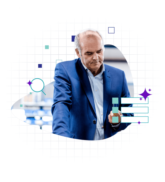
Work smarter (and faster). With total focus.
With Pega Platform, you’ll make it easier for employees to access relevant answers faster – and become more effective and efficient.
- Goodbye, tedious data searches. Oh hi, Pega GenAI Knowledge Buddy™. Get info ASAP and accelerate back-office work.
- If your data can’t chat with you, is it even useful? Pega GenAI Analyze™ lets you ask your data for everything from actionable insights to workflow analyses.
- Context is everything. Pega GenAI Coach™ guides users based on each unique case, every single time.
Double developer productivity
Timelines, turbocharged. With Pega Platform, you’ll build and manage workflows and apps to deliver on everything, at light speed.
- Everyone faster, all together. Pega App Studio enhancements guide developers of all levels to get more done in one collaborative, model-driven environment.
- Use Pega Constellation’s UX enhancements to deliver better experiences to all users, everywhere (and anywhere) they are.
- Import Pega GenAI Blueprints™ like a pro. Jumpstart productivity like never before. You’ll accelerate time to value and make every project everyone’s fave.

GenAI suite
Your vision, realized at scale with Pega GenAI™. The first generative AI for the enterprise.

Create, optimize and collaborate on workflow design, fast. Explore more >

Unlock the collective knowledge of your enterprise. Explore more >

Make every employee your best employee with AI-powered contextual guidance. Explore more >

Understand more. Contact sales to learn more >

Automate more. Contact sales to learn more >

Build more. Contact sales to learn more >

See how Pega’s GenAI for the enterprise can unlock unprecedented, business-transforming outcomes.
Explore the platform Explore Pega CRMPega Infinity 24.1 Webinars
Watch an on-demand industry-specific webinar to discover how stakeholders across your organization can do more. Learn how Infinity 24.1 can add impact, speed and value.
Select your industry replay